As someone who has spent years analyzing game design and following the evolution of artistic styles in gaming, I have seen how hand drawn visuals can transform a title from simply good to truly unforgettable. These games are crafted by studios that push the boundaries of interactive art. From the ink painted landscapes of Okami to the emotional watercolors of Gris, this list highlights titles celebrated by critics, adored by players, and revered by developers for their artistry.
The Banner Saga | 2014 | Stoic Studio
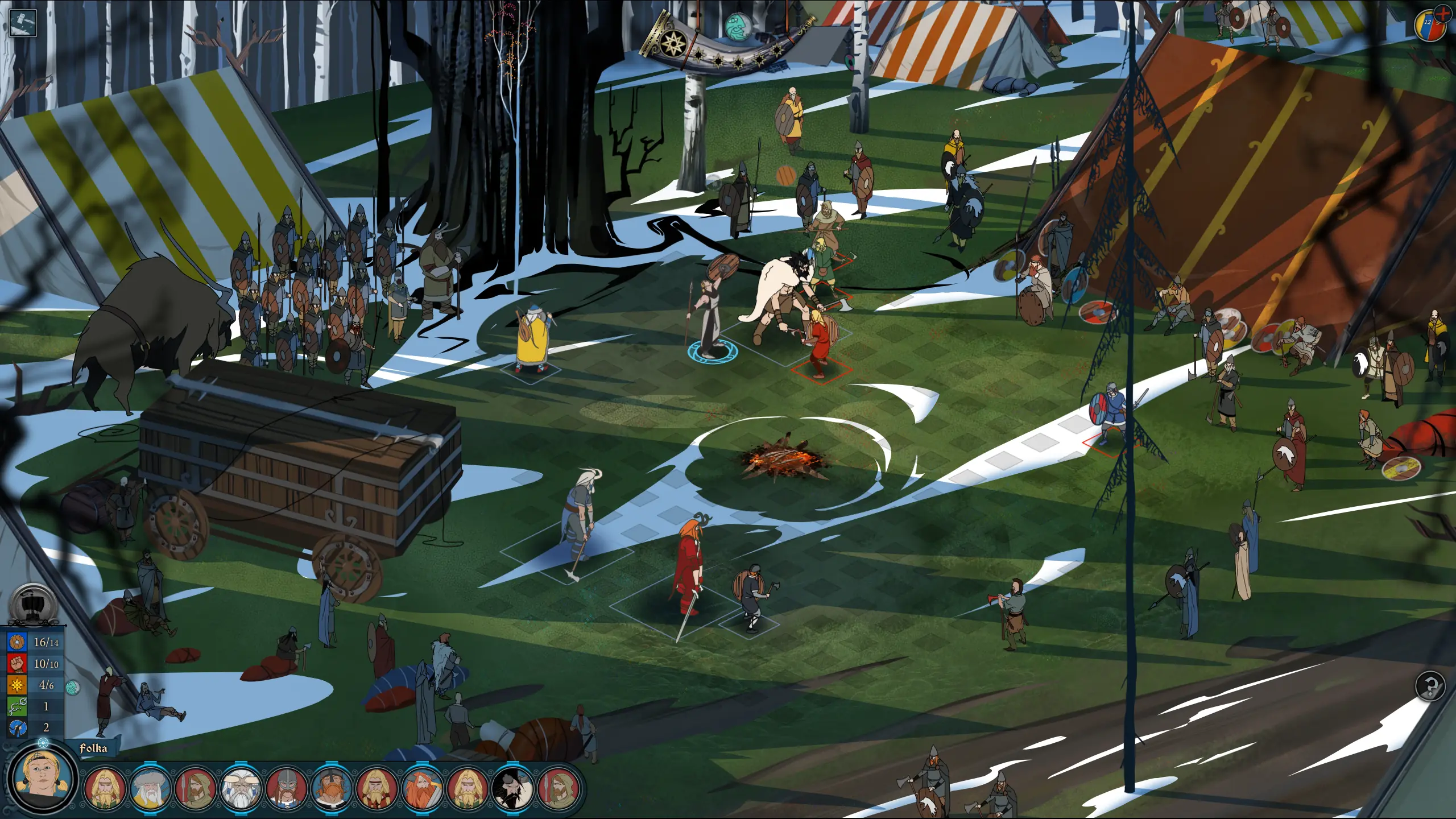
The Banner Saga tells a Viking inspired tale with rotoscoped, tapestry like art. Its stately visuals and emotional narrative carved a unique space in the strategy genre and earned acclaim for mature storytelling.
Why it belongs: A lesson in how character animation and UI motifs can carry tone in a tactics game.
Child of Light | 2014 | Ubisoft Montreal
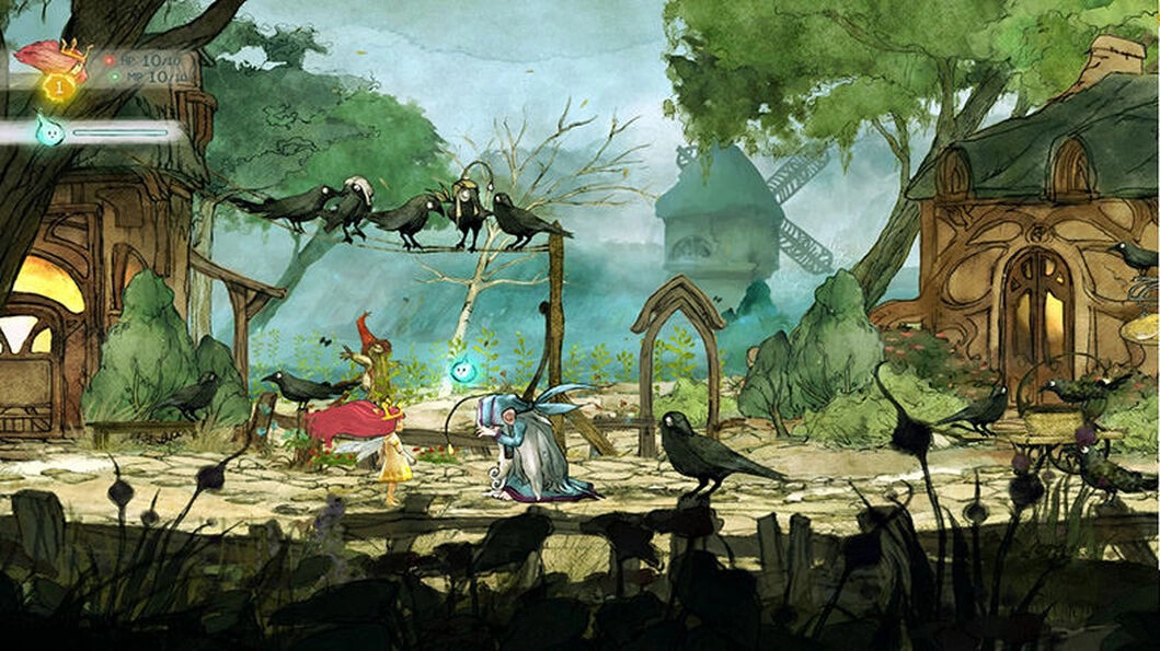
A modern fairytale, Child of Light uses storybook watercolor visuals and verse to tell Aurora’s coming of age. Elegant turn based combat and lyrical writing show that RPGs can be as visually poetic as they are strategic.
Why it belongs: Demonstrates cohesive art direction across UI, type, and animation.
Ori (Series) | 2015–2020 | Moon Studios
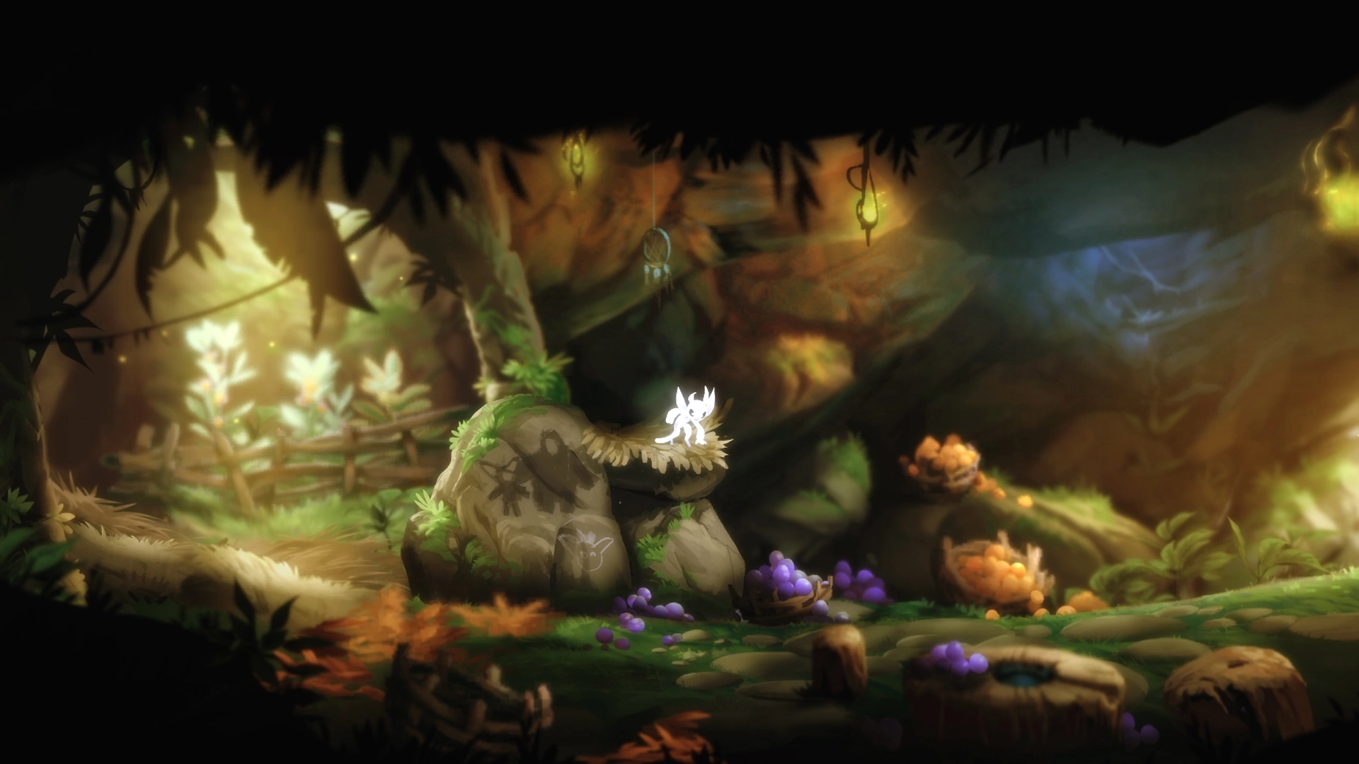
Ori and the Blind Forest and Ori and the Will of the Wisps set benchmarks for beauty in platformers. Painterly backgrounds, glow effects, and fluid animation create worlds that feel alive and responsive.
Why it belongs: A masterclass in readable platforming silhouettes and atmospheric lighting.
Jotun | 2015 | Thunder Lotus Games
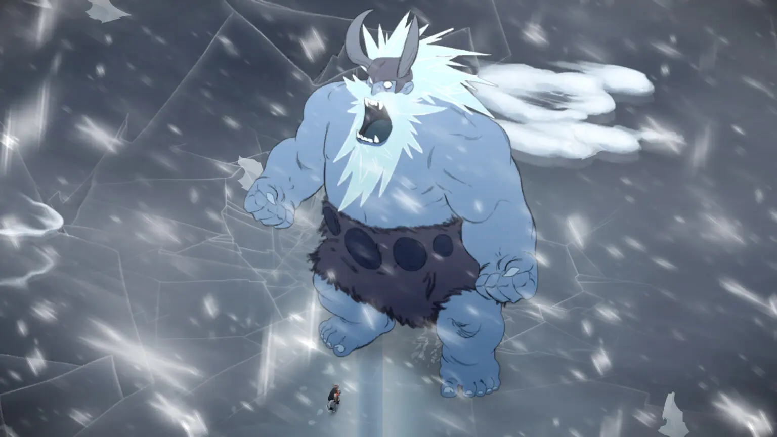
Steeped in Norse myth, Jotun stands out for hand animated titans and mythic scale. Exploring realms inspired by Viking legend, players face colossal bosses that feel both elegant and intimidating.
Why it belongs: Shows how 2D animation can sell scale without 3D spectacle.
Okami HD | 2017 | Clover Studio / Capcom
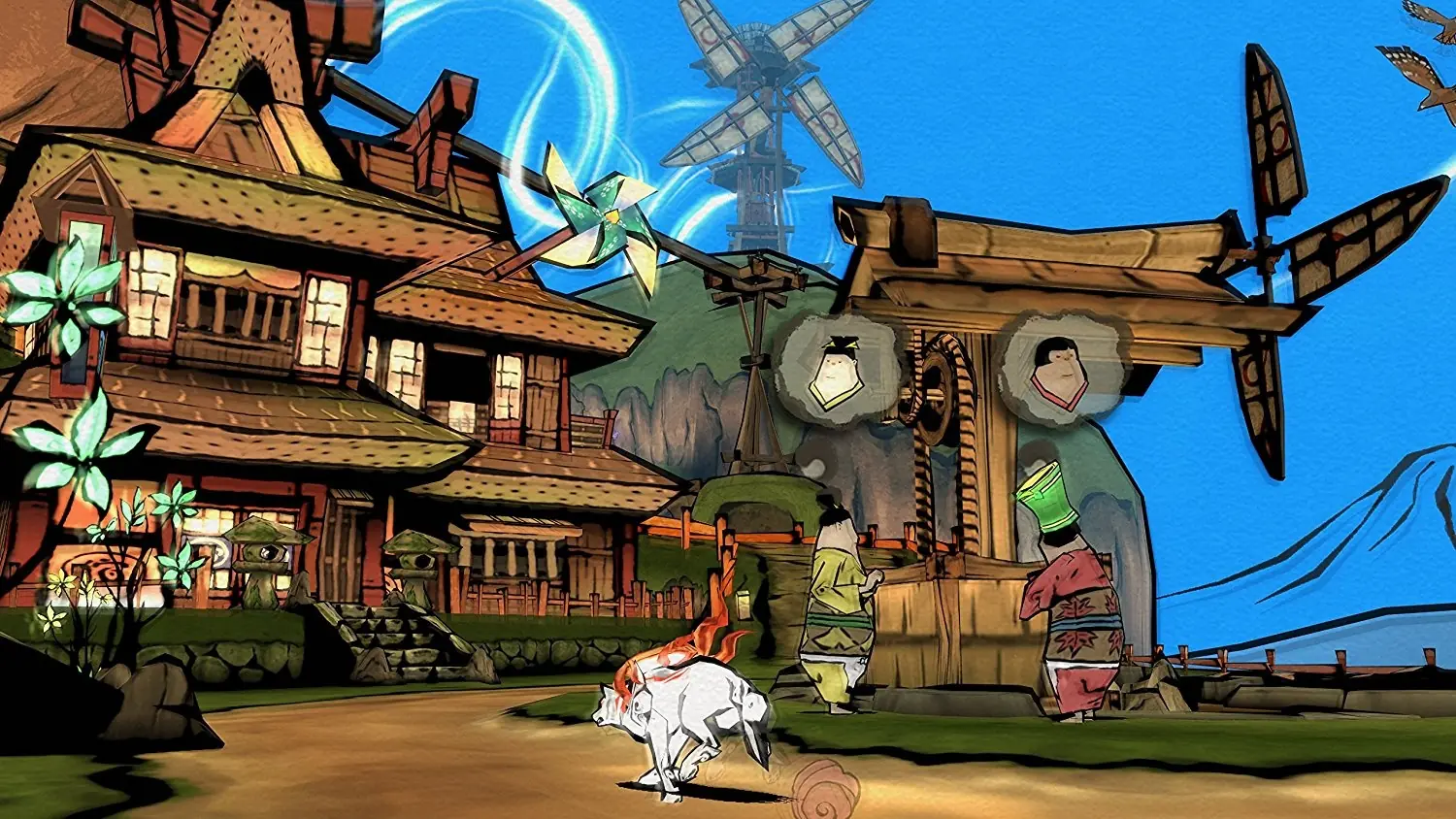
Few games embody “art in motion” like Okami. Its sumi e ink wash style draws from Japanese calligraphy and woodblock prints. Playing as Amaterasu, you paint with the Celestial Brush to restore a cursed land.
Why it belongs: A direct fusion of mechanics and visual style that still feels fresh.
Hollow Knight | 2017 | Team Cherry
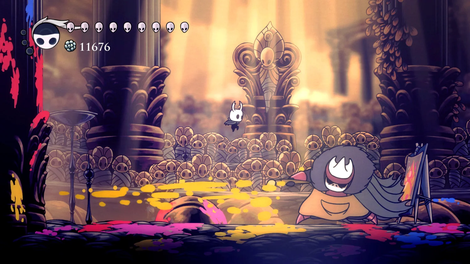
Hollow Knight merges gothic minimalism with a sprawling insect kingdom. Sharp line work, clean silhouettes, and restrained color make every room readable while reinforcing mood.
Why it belongs: Proof that consistent line art and silhouette can scale to a huge world.
Cuphead | 2017 | Studio MDHR
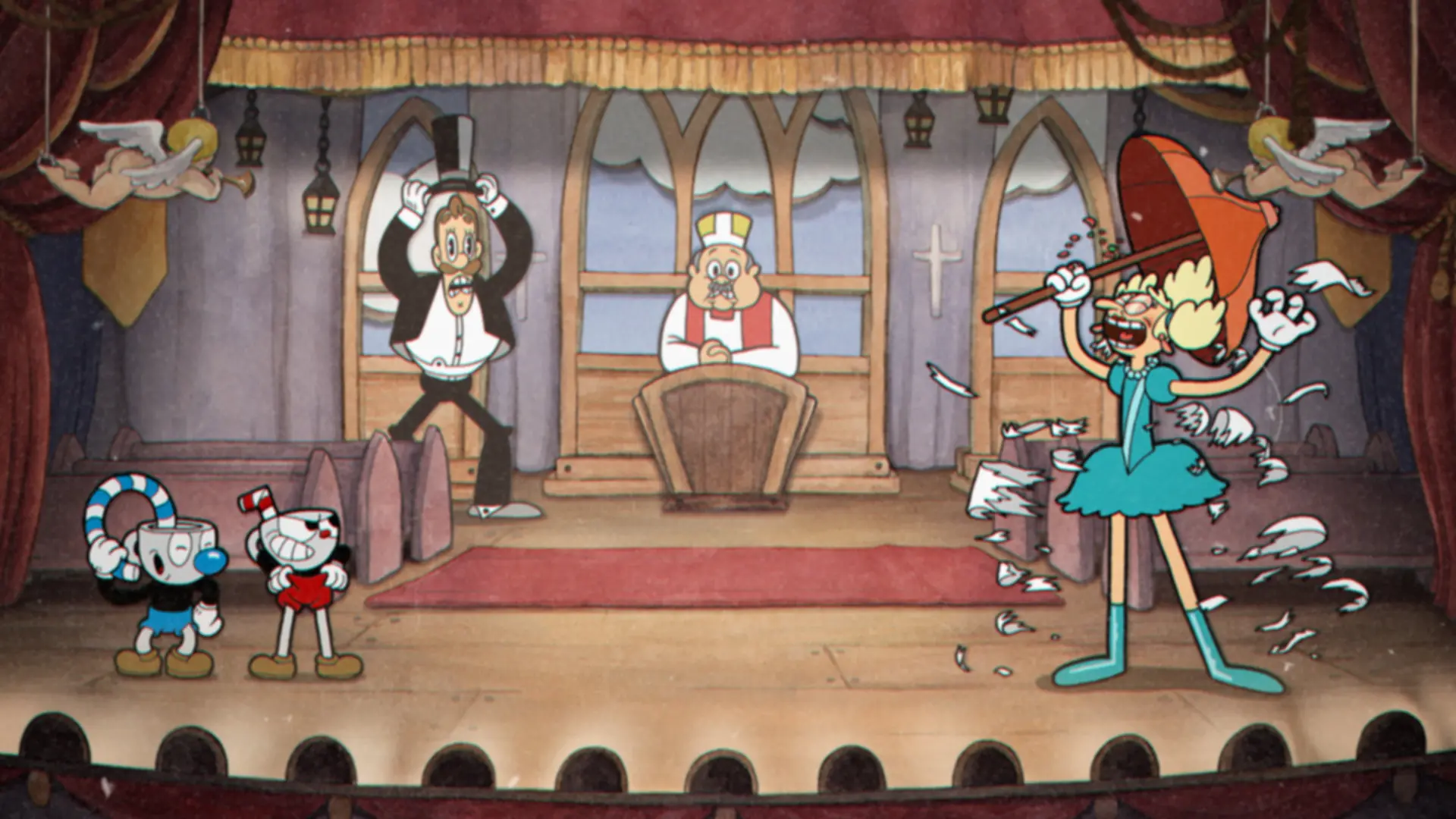
A 1930s cartoon brought to life, Cuphead is hand inked and painted frame by frame. It became a cultural moment thanks to exacting run and gun design and impeccable big band presentation.
Why it belongs: Traditional animation techniques executed with modern game feel.
Gris | 2018 | Nomada Studio / Devolver Digital
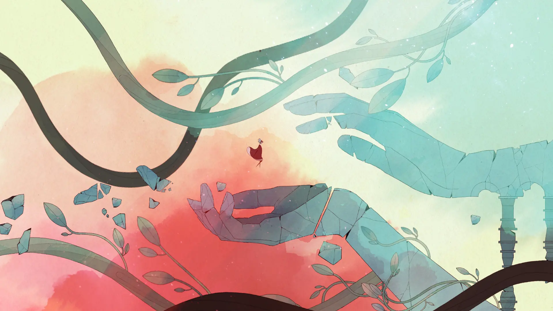
Often called a moving painting, Gris uses watercolor and subtle line work to tell a story of loss and renewal. Color returns as you progress, mirroring the arc of healing.
Why it belongs: Elegant visual metaphors that align art, music, and mechanics.
Spiritfarer | 2020 | Thunder Lotus Games
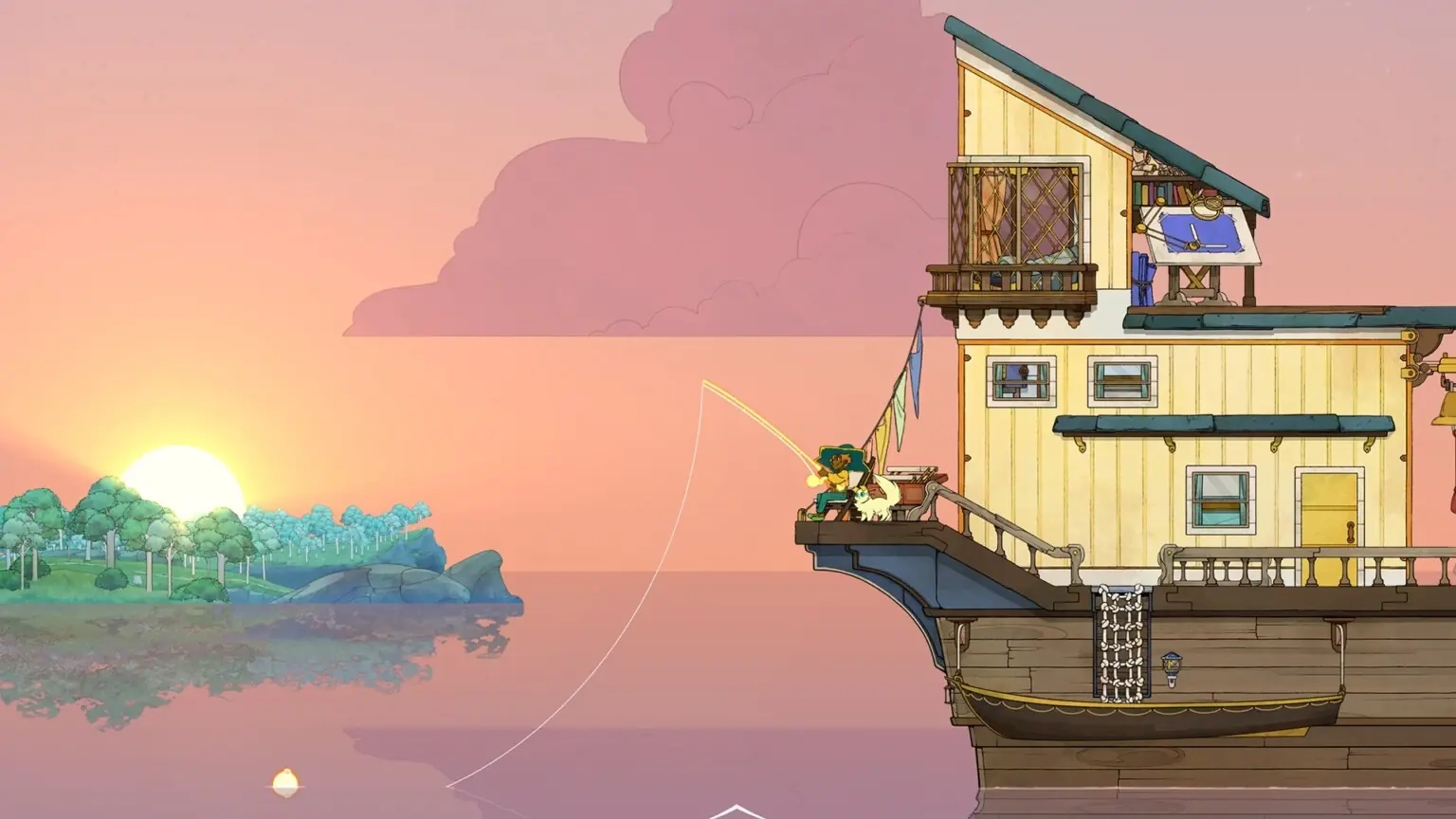
Spiritfarer is a hand painted management adventure about ferrying souls to the afterlife. Warm animation, characterful UI, and gentle pacing make it one of the most touching indies of its era.
Why it belongs: Shows how soft animation and color can support compassionate themes.
Wytchwood | 2021 | Alientrap Games
Wytchwood is a storybook folklore adventure where you play a crafty witch gathering ingredients, brewing potions, and solving problems with whimsy. Its cut paper aesthetic feels cozy and distinctive.
Why it belongs: A great example of stylized materials and texture in 2D.